
Here’s a 2-minute video using Adobe Indesign to create a newspaper front page that I made a couple of years ago for the Capital Press newspaper in Salem, Oregon.
I generally will try two or three different arrangements when I build a cover and that is what you will see here. Click on the link below.
I generally will try two or three different arrangements when I build a cover and that is what you will see here. Click on the link below.

Here’s another example of creating a centerpiece using both Indesign and Photoshop.
This may get a little complicated, especially if you don’t know Photoshop and/or Indesign very well. But here is how I created the centerpiece.
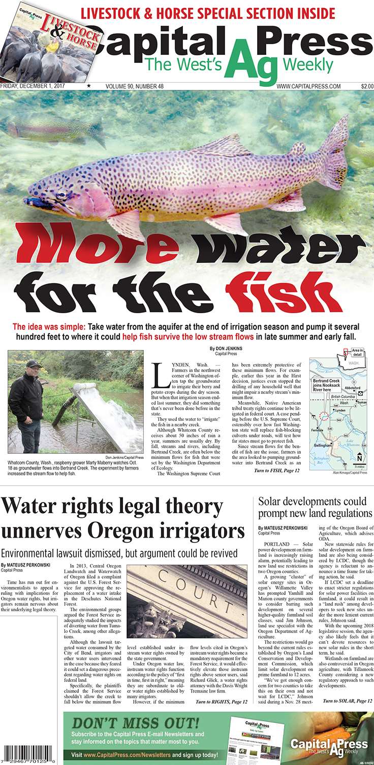
THINK LAYERS
I first cutout the trout on this stock image using Photoshop, enlarged it slightly on its own layer, erased the original image on the background layer and saved it as a PSD.
I then pulled the psd image onto the page in Indesign, faded the bottom of the image with gradient fade.
Once this was done I wrote the headline and overlaid it onto the image. The font is the Universal Heavy.
Next I duplicated the image and brought it to the top, which now covered the text. I also turned off any text wrap on the image. Next I went into the Object menu tab and down to Object Layer Options where I turned off the Background layer.
I then added a drop shadow to the foreground trout making sure it was broad enough to give it some distance from the background and light enough so it didn’t obscure the headline text.
I could have stopped there but I’m thinking that if the text really was underwater then it would be a little bit distorted so I figured why not. If I’m gong to jump in I might as well get all the wet, or something like that.
Anyhow, there are a number of ways you can alter text both in Indesign and Photoshop. I chose to use photoshop just because for me it was quicker for what I had in mind.
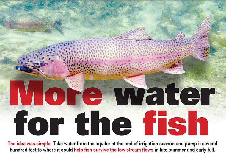
Above is the result of the layers and drop shadow. Now comes the fun part.
CREATE A PDF
In Indesign I saved the page as a PDF file. I then opened it in Photoshop. Once the pdf was opened I went to the Filter tab and clicked on Liquify.
From there I adjusted the settings so and tool size to get the effect I was looking for. After a couple of passes with a broad tool setting I made the tool about half the size and did a few drags on some individual letters to make it look not so uniform in its squiggles.
When I was satisfied with the results I again saved the image as a pdf.
IMPORT THE PDF
Once back in Indesign I deleted both the original image, the duplicated image and the headline text.
Next I pulled in the new pdf into a photo box and there it is.
Like I said there are numerous ways to achieve the same results. that’s just the way I chose.
You can visit www.capitalpress.com to read the complete stories you see on this page.
.
You can visit www.capitalpress.com to read the complete stories you see on this page.
.


No comments:
Post a Comment